As anyone who follows me on Twitter has noticed,
I’ve been mildly utterly obsessed with Playdate, an
upcoming handheld game system by Panic. As of the time of
writing, the device has yet to be released, but the Developer Preview program
will be beginning soon. I have spent spare time these past few months
experimenting with art and code in anticipation of the SDK, and thought I would
share my thoughts and observations over a few blog posts, in hopes that some of
it may be helpful to developers and designers. In this first post, I want to
talk about making art for Playdate, with a particular focus on scale, or
choosing the size to make your art tiles and sprites.
I would also like to eventually talk about things like techniques for 1-bit
black and white art, but since this post clocks in at about 1,800 words, I think
I’ll have to save that for another day!
Note: as of writing, I have no access to the SDK, and not only do I not have a
Playdate, I have never even seen one in person. I’ve made myself some software
tools to let me see my Playdate art at the correct scale, but you should consider my lack of
direct experience with the hardware when reading this. It’s entirely possible my
recommendations are grievously ill-informed!
Similar, but so Very, Very Different
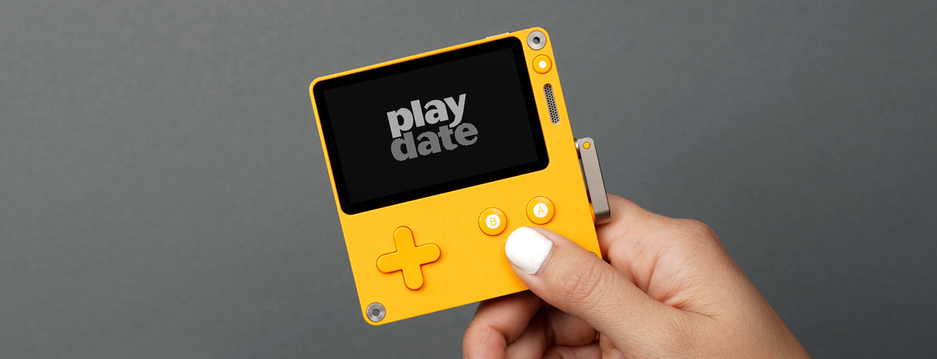
At first glance, Playdate looks very much like a Game Boy. It has a black and
white display, a d-pad, and two action buttons. But it’s also got a menu button,
a USB-C port, and a crank, but on first impression it looks very familiar.

Playdate
That familiarity piqued my attention before anything else. I’ve always had a
strong fondness for the Game Boy, so much so that over the past few years I’ve
begun doing homebrew Game Boy development as a hobby. A few years ago, I
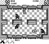
released a game called Bubble Factory,
inspired by Game & Watch games and the later Game & Watch Gallery series of
Game Boy titles.

Bubble Factory for Game Boy
When Panic announced Playdate, I knew I wanted to develop for it. But I also
didn’t want to wait for the SDK, so I set to work learning everything I could
about the device. I wrote a set of C APIs that provided a Playdate-like
environment, and then wrote an SDL backend for the APIs to let me run code for
that environment on my Mac, with the thinking that once I get the SDK I could
yank out the SDL backend and replace it with an actual Playdate SDK backend.
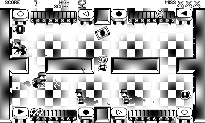
I’ve programmed various art and gameplay experiments since then, one of which is
a version of Bubble Factory for Playdate.

Bubble Factory for Playdate
One of the first things that may stand out to you about the Playdate version
versus the Game Boy version is the size: Playdate’s screen has a 400x240
resolution, versus the Game Boy’s 160x144. If you’ve done any development for
old systems, or if you’ve designed retro-style pixel art games, this resolution
may at first feel like it gives you a huge canvas to work with, but it’s
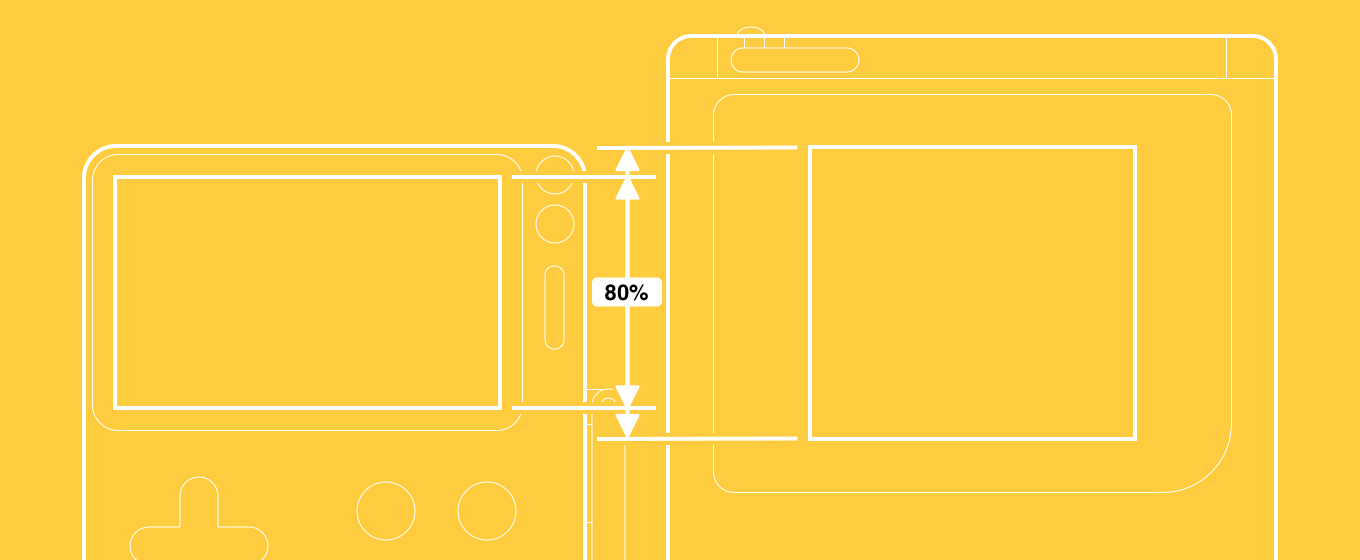
important to keep things in perspective. Even though Playdate’s resolution is
really high, the display’s physical size is somewhat comparable to the Game Boy,
meaning the device has a high pixels-per-inch ratio. In fact,
even though Playdate’s display is wider than the Game Boy’s, and slightly larger
across the diagonal, it’s actually a little shorter vertically.

Playdate Compared to Game Boy
This is why I wanted to make this post. If you design for Playdate at the scale you
would for retro systems or retro-style games, you may accidentally make art that’s
uncomfortably small when viewed on the screen, so I want to offer some
observations and suggestions.
16 Pixel Sprites, 8 Pixel Fonts
Graphics processing hardware has long been a feature of game systems, but before
3D acceleration took off we had 2D sprite hardware. Sprite processors were
capable of blitting small 2D images to a screen significantly faster than CPUs
would otherwise be capable of. Often, these systems would be built around 8x8
pixel tile images, which would be composed together to form the screen image.
Tiles could be arranged in a grid to form the background map, and tiles with
transparent cutouts could be layered on top for sprites. 8x8 pixel images were
rather small, so many games would use 2x2 arrangements of these tiles together
to form a base 16x16 pixel size for tile maps and sprites. These 2x2 tile
arrangements were called metatiles, but I will confusingly just refer to them
as tiles from here on out, just understand that on systems like the NES, 16x16 pixel
“tiles” were actually 2x2 arrangements of 8x8 pixel native tiles.

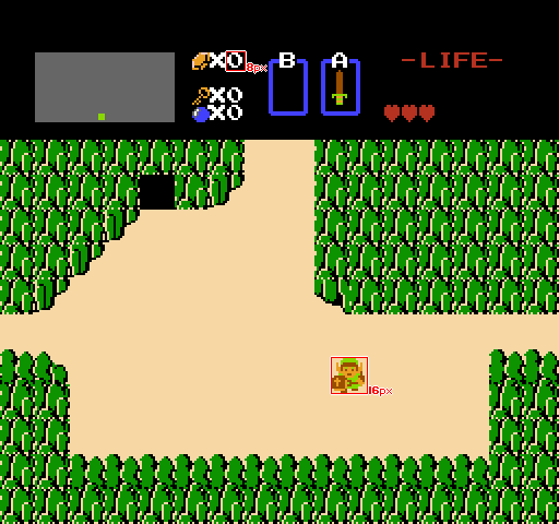
The Legend of Zelda
Many games were built with 16x16 pixel sprites and map tiles. On the NES, with
a resolution of 256x240, a background map made of 16 pixel tiles would give you
a 16x15 tile viewable field size.
The Game Boy also had 8x8 pixel hardware tiles, and so 16x16 pixel
map tiles and sprites continued to commonly appear, despite the Game Boy’s lower
screen resolution of 160x144.

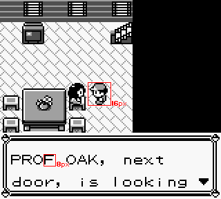
Pokémon
While sprites and map tiles were commonly 16x16 pixels, it was also common to
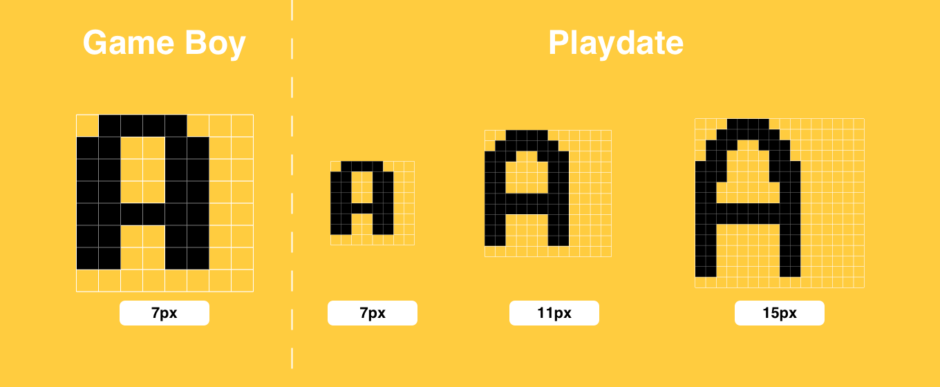
make fonts fit within 8x8 pixel tiles. Usually, these fonts would have a cap
height of 7 pixels, with 1 pixel remaining on the bottom for descenders.
Examples of these are highlighted on both of the earlier screenshots.
Because these sizes were so common, they continue to be strongly associated with
retro games today. Shovel Knight,
for example, is a modern retro game, and while most sprites are larger than 16
pixels, it continues to use an 8-pixel monospace font and has maps made of 16
pixel tiles.
Since Playdate is so evocative of older systems, then, it may be tempting to use
similar sizes when designing for it. But I feel that would likely be a mistake.
Because the pixel density is so high, an 8-pixel font or 16-pixel character will
look very small on the screen.
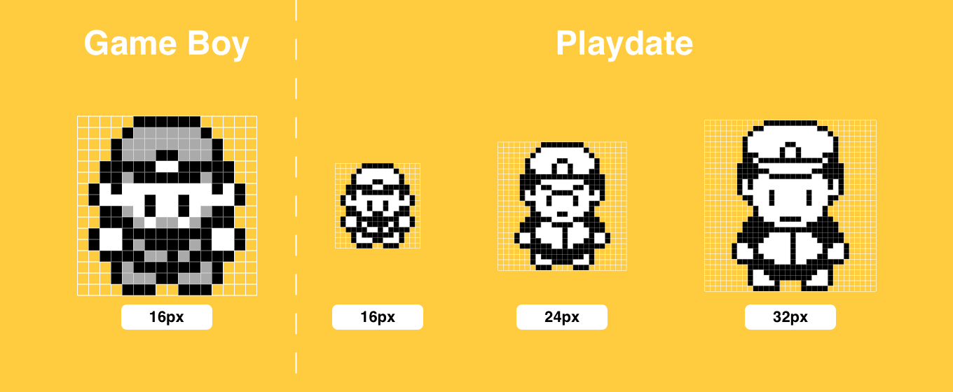
Playdate Sprite Sizes to Scale Against Game Boy
In fact, art of any given size will appear about half as big as it would on
the Game Boy. Because of that, consider drawing larger assets than you might
otherwise if you were designing a retro-style game. A 24-pixel character on
Playdate will appear slightly smaller than a 16-pixel character on the Game Boy,
and a 32-pixel character on Playdate will be comparable to the Game Boy’s 16.
If you have experience designing for smartphones, making Playdate art versus art
for retro systems feels almost like designing assets for a “Retina” display as
compared to a “1x” display.

Playdate Font Sizes to Scale Against Game Boy
This scaling advice applies with particular emphasis for fonts. Sharp though the
display may be, an 8-pixel (or smaller) font will appear very small, and may
be difficult to read, especially for body text. I previously tweeted out an
earlier mockup image of Bubble Factory, and
Neven Mrgan at Panic
uploaded the image to a device.
But the font for “Score”, “High Score”, and “Miss” was smaller than it is today,
and Alex Guichet observed that it may be too
small, which Neven confirmed to be the case.
Now, the font today is larger, but still pretty small 😬, so here I go ignoring
my own advice, but I feel a reasonable exception exists for minor text elements.
If you look at the clock in Crankin’s Time Travel Adventure,
you’ll see that the “PM” font is far smaller than 8 pixels, but the time font is
much larger. Important text, including dialog, scores, and health, should lean
towards larger fonts.
Tile Size for Grid-Based Games
Because Playdate uses a CPU-based bitmap renderer instead of dedicated sprite
hardware (note: I suppose I could be wrong on that, but as I understand it’s
the case), you’re not really boxed into grid-based games with tiles that are a
multiple of 8 pixels in size—Crankin’s Time Travel Adventure certainly isn’t—but if you
make a game based on a grid, you need to choose a base tile size.
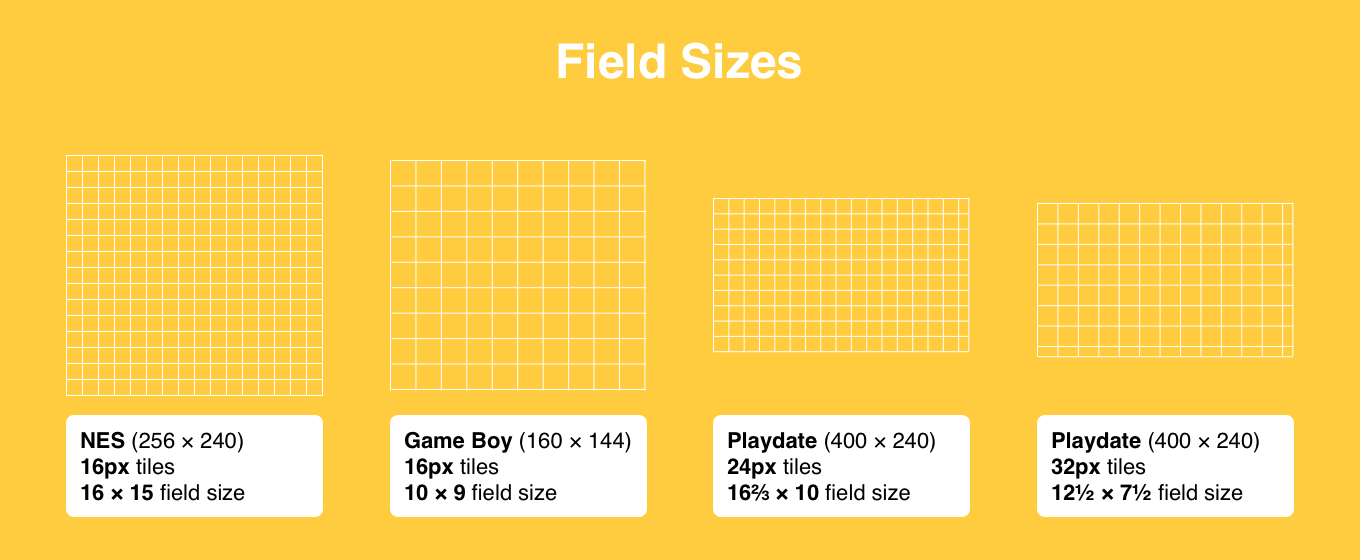
I’m going to refer to the number of tiles on screen as the field size. The
field size has an inverse relationship to the tile size. The larger your tiles,
the fewer of them you can fit on screen. For example, a hypothetical 100-pixel
screen could fit 4 tiles if they’re 25 pixels each, but 5 tiles if they’re 20
pixels.
Field size is also independent from map size, which is the overall horizontal
and vertical number of tiles in a level. Field size refers to the subset of a
map that can be viewed on screen in a given moment. If the map size is larger
than the field size, then scrolling will be necessary to view the whole map.
Smaller fields tend to feel more cramped, because you can’t see as many tiles
away from your character, but larger fields require smaller tiles, which can be
harder on the eyes. Therefore, you need to strike a balance between the two.

Viewable Field Areas for Different Resolutions and Tile Sizes
With 16 pixel tiles, the NES has a 16x15 field size, and the Game Boy has a
10x9. If you played Mega Man games on both the NES and the Game Boy, you may
recall that the Game Boy games tended to feel more cramped, because sprites
and map tiles were the same size as on the NES, but the field size was
smaller on the Game Boy.
Since Playdate’s screen size is comparable to the Game Boy (especially along the
vertical axis), you may want to pick a tile size that gives you a
comparable field size. If your tiles are 24 pixels, your field would be 10 tiles
tall, while 32 pixels would give you a field 7.5 tiles tall. You can also choose
smaller or larger tiles, with the natural tradeoffs for viewing comfort versus field size.

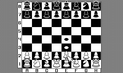
Chess
You may also want to consider non-square tiles. When I designed a Chess set,
I made 24 and 32-pixel variants. I really liked the 32-pixel pieces, but a Chess
board is 8 squares tall, and so it wouldn’t fit a 7.5 tile field. But by
squishing the y-axis and letting the pieces overlap the squares above them, I
got the whole board (and then some) to fit while holding 32-pixel pieces, and it
gives the board a nice perspective feel, too. Be creative!
I spent much of this blog post directly comparing the Game Boy to Playdate, but
I want to emphasize that Playdate is very much its own thing, so don’t feel
constrained by old sizing conventions. Do what feels right for your game, just
be aware that the screen has a high pixel density, so you should consider
whether you’re designing something that’ll appear too small.
