Introduction
Placeholder for documentation landing page.
function love.load()
	print("Testing a LUA block")
end
Installation
IUI itself is engine-agnostic. It doesn’t know how to receive input or draw to the screen. Backend libraries connect IUI to game engines. Thus, you need to install both the IUI library and a backend library to use the toolkit.
Core Library
- iui: required regardless which backend you choose
Backends
Sample Projects
- iui-sample-love: sample project for LÖVE
- iui-sample-lovr: sample project for LÖVR, featuring both desktop and VR modes
LOVË
local iui = require "iui"
local backend = require "love-iui"

local labelText = "Click the button!"

function love.load()
    iui.load(backend)
end

function love.update(dt)
    iui.beginFrame(dt)
    iui.beginWindow(love.graphics.getDimensions())

    iui.panelBackground()
    iui.label(labelText)
    if iui.button("Say Hello") then
        labelText = "Hello, World!"
    end

    iui.endWindow()
    iui.endFrame()
end

function love.draw()
    iui.draw()
end

function love.mousemoved(x, y, dx, dy)
    backend.mousemoved(x, y, dx, dy)
end

function love.mousepressed(x, y, button)
    backend.mousepressed(x, y, button)
end

function love.mousereleased(x, y, button)
    backend.mousereleased(x, y, button)
end

function love.wheelmoved(x, y)
    backend.wheelmoved(x, y)
end

function love.keypressed(key, scancode, isRepeat)
    backend.keypressed(key, scancode, isRepeat)
end

function love.keyreleased(key, scancode)
    backend.keyreleased(key, scancode)
end

function love.textinput(text)
    backend.textinput(text)
end
LÖVR - Desktop
conf.lua
function lovr.conf(t)
    t.modules.headset = nil
end
main.lua
local iui = require "iui"
local backend = require "lovr-iui"
local mouse = require "lovr-mouse"

local labelText = "Click the button!"

function lovr.load()
    backend.mouse = mouse

    iui.load(backend)
end

function lovr.update(dt)
    iui.beginFrame(dt)
    iui.beginWindow(lovr.system.getWindowDimensions())

    iui.panelBackground()
    iui.label(labelText)
    if iui.button("Say Hello") then
        labelText = "Hello, World!"
    end

    iui.endWindow()
    iui.endFrame()
end

function lovr.draw(pass)
    backend.graphics.pass = pass

    iui.draw()
end

function lovr.mousemoved(x, y, dx, dy)
    backend.mousemoved(x, y, dx, dy)
end

function lovr.mousepressed(x, y, button)
    backend.mousepressed(x, y, button)
end

function lovr.mousereleased(x, y, button)
    backend.mousereleased(x, y, button)
end

function lovr.wheelmoved(x, y)
    backend.wheelmoved(x, y)
end

function lovr.keypressed(key, scancode, isRepeat)
    backend.keypressed(key, scancode, isRepeat)
end

function lovr.keyreleased(key, scancode)
    backend.keyreleased(key, scancode)
end

function lovr.textinput(text)
    backend.textinput(text)
end
LÖVR - VR
conf.lua
function lovr.conf(t)
    t.headset.supersample = 2
end
main.lua
local iui = require "iui"
local backend = require "lovr-iui"

--- @type LovrIUIWorldWindow
local window

local labelText = "Click the button!"

function lovr.load()
    iui.load(backend)

    window = backend.worldWindow.new()
end

function lovr.update(dt)
    iui.beginFrame(dt)

    if window:beginFrame() then
	    iui.beginWindow(window.w, window.h)
        iui.panelBackground()
        iui.label(labelText)
        if iui.button("Say Hello") then
            labelText = "Hello, World!"
        end
        iui.endWindow()

        window:endFrame()
    end

    iui.endFrame()
end

function lovr.draw(pass)
    window:draw(pass)
end
Identifiers
IUI requires unique identifiers to distinguish between different widgets, as it typical for immediate mode UIs. Identifiers allow IUI to know that a given widget has persisted between frames, even if other widgets were added or removed, or the widget moved to a new location in the UI. This allows IUI to manage things like focus and interaction across frames.
Naming an Identifier
Many widgets take a name as their first parameter, such as iui.button. Often, these names will be displayed to the user as a control’s text. But, importantly, these names are also used to identify the widget to IUI. This imposes some restrictions that may be surprising.
Uniqueness
Most importantly, identifiers must be unique. If two widgets have the same identifier, IUI cannot distinguish them, and surprising behaviors may result. For example, the focus system will get confused, or the user interacting with one control may activate the other. Widget identifiers must be unique even across widget types.
If two widgets use the same ID, IUI will print a warning.
if iui.button("myWidget") then
	-- Perform action
end

-- Invalid ID: the checkbox has the same ID as the button
-- IUI will print a warning like "Warning: duplicate hash for myWidget"
checkValue = iui.checkbox("myWidget", checkValue)
Technically, IUI identifies widgets using ID hashes, not identifiers themselves. This means there’s a small chance that two widgets with different IDs may have an ID collision anyway. This is very unlikely in practice, but not impossible.
Scoping
Fortunately, you do not necessarily need to guarantee ID uniqueness across your entire interface. Some widgets create identifier scopes. IDs only need to be unique within their scope. Typically, container widgets create new scopes. For example, iui.subMenu creates a new scope, and iui.splitView creates scopes for each side of the split.
splitValue = iui.splitView("splitter", "horiz", splitValue,
	function()
		if iui.button("aButton") then
			-- Perform action
		end
	end,
	function()
		-- This is fine! Even though both buttons have the same
		-- ID, they're in different identifier scopes
		if iui.button("aButton") then
			-- Perform action
		end
	end
)
Stability
A given widget’s ID should be stable across frames. If the identifier changes, IUI will believe it’s a different widget.
buttonName = "Push Me"
if iui.button(buttonName) then
	-- Not good. The button's ID will change
	buttonName = "You Pushed Me"
end
Implementing Identified Widgets
If you implement a new widget, you may need to identify it to IUI. To do so, take in a parameter that will serve as the identifier to the user, and pass it to iui.beginID to get your identifier. At the end of your widget, call iui.endID. Every call to begin an ID must be balanced by a call to end the ID.
local function myWidget(name)
	local id = iui.beginID(name)

	iui.endID()
end
You typically only need to generate an identifier if your widget is interactive. For example, iui.becomeHover, iui.becomeFocus and iui.becomeActive are all based on the current identifier. Most non-interactive widgets, like iui.label, do not generate identifiers.
Identifier Scopes
Calling iui.beginID opens an identifier scope, which closes when you call iui.endID. As mentioned earlier, identifiers only need to be unique within their scope. If you are creating a container widget, place your child content between the calls to iui.beginID and iui.endID. Since identifier scopes make collisions less likely, you may want to create an identifier scope in a container widget even if it’s not interactive.
local function myContainerWidget(name, content)
	local id = iui.beginID(name)

	content()

	iui.endID()
end
Advancing Layout
The ID system interfaces slightly with the layout system to deliver a small convenience: by default, iui.endID calls iui.layout.advance.
The layout system does not advance from one widget position to the next until iui.layout.advance is called. This is almost always desirable at the end of a widget, and most widgets have identifiers, so iui.endID makes this call for you.
If you’re creating a non-interactive widget, you need to advance layout manually yourself. Widgets like iui.label do this.
On rare occasion, you might not want an identified widget to advance the layout. For example, iui.listView embeds an iui.scrollView widget, and the scroll view advances the layout. If the list view advanced the layout, it would cause the layout to advance twice, when it should only do so once. To support cases like this, iui.endID takes an optional advanceLayout boolean parameter. Passing false as an argument will prevent iui.endID from calling iui.layout.advance.
Layout
The layout engine is built around two key concepts: panels and rows. Panels are rectangular regions within a window. Rows are placed within panels. The layout engine places widgets inside rows inside panels.

Panels
A panel is a 2D rectangle in a window. You can create a panel at any time by calling iui.layout.beginPanel(x, y, w, h, margin?). If you begin a panel, you must end it later by calling iui.layout.endPanel(advance?). When you begin a panel, it becomes the current panel, and when you end it, the previous panel becomes the current panel again. The current panel is used to lay out rows.
It’s common to create child panels within a panel. For example, the split view widget fills the current panel, and creates two sub-panels: one for each side of the split. You may then place widgets within the sub-panels, or even create further panels inside.
Even though there’s a conceptual parent-child hierarchy, panels may be placed anywhere in a window, even outside their parent panel. Typically, though, you’ll want to base a panel’s frame on its parent’s. You can get the bounds of the current panel by calling iui.layout.getPanelBounds(index?), which returns the x, y, w, and h of a panel. You may then use those values as a basis for the new bounds you pass to beginPanel.
Rows
The layout engine uses rows in panels to size and position widgets. Rows can have multiple columns. When you add a widget, the layout engine places it in the current column of the current row of the current panel. It then advances to the next column for the next widget. If you place widgets in every column of a row, the layout engine then wraps around to the next row.
You configure the row layout by calling iui.layout.beginRow(columns, rowHeight?). You can pass a custom value for rowHeight, or let the layout engine set a default by omitting the argument.
-- The layout engine will lay out widgets in rows having two dynamic-width
-- columns. Since we're not passing a `rowHeight`, the layout engine will
-- determine one for us.
iui.layout.beginRow({ kind = "dynamic", count = 2 })

-- Now, we add three widgets. The first two widgets will go in the first row,
-- and the third in a second row.
iui.label("Label 1")
iui.label("Label 2")
iui.label("Label 3")
The power of the row system comes from the columns argument. You can configure the columns to be in one of several modes: fixed width, dynamic width, mixed width, and intrinsic width.
Fixed Width Columns
{
	kind: "fixed",
	size: number
}
When using fixed width columns, columns will be size points wide, and the layout engine will fit as many columns as possible within the current panel’s available width.
Dynamic Width Columns
{
	kind: "dynamic",
	count: number
}
With dynamic width columns, the layout engine will place count columns within the width of the current panel, with their size set proportionally.
When you begin a new panel, if you don’t configure the row yourself, the layout engine automatically configures the row to be dynamic width with a count of 1. So the default is one widget per row, with each widget filling the entire width of the panel.
Mixed Width Columns
{
	kind: "mixed",
	columns: {
		kind: "fixed" | "dynamic",
		size: number
	}[]
}
Mixed width columns allow you to have both fixed and dynamic columns in a row.
To calculate the size of mixed width columns:
- Initially, the full width of the panel is available.
- Fixed columns are given their requested
size, which is also subtracted from the available width. - The remaining width is distributed to the dynamic columns, proportionally weighted by their
size.
If you had two dynamic columns in a mixed width row, one with a size of 2.0, and the other with a size of 1.0, the first would receive two-thirds of the available space, while the second would receive one-third.
Intrinsic Width Columns
{
	kind: "intrinsic",
	default?: number,
	limit?: number
}
Intrinsic width columns are an advanced feature with capabilities unavailable to other modes, but limitations to be aware of. They allow widgets to suggest their desired, natural width, and try to set the column width to that intrinsic size.
If a widget produces an intrinsic width, that will be used as the column width. If not, a default width will be used. If you pass a default width in iui.layout.beginRow, that width will be used as a fallback. If you don’t pass default, then the default will be however much space is still available in the row.
By default, intrinsic width columns will place as many columns in a row as will fit. If a widget is too wide to fit in the current row, it’ll be placed on the next row. You can pass a limit to cap the number of widgets that may be placed in a row.
Important
Intrinsic width columns measure their aggregate content size as they go, but this size isn’t available until after layout has been performed once. This creates a problem if you need that size before placing widgets, such as to size their containing panel. It’s up to you to decide how to handle this. Built-in widgets that use intrinsic width columns, like submenu panels, don’t draw anything on the first frame, instead using that frame only to calculate the size of the panel.
Fill Panel
If you just want to make a widget fill its entire panel, horizontally and vertically, you may call iui.layout.fillPanel(). This will cause the next widget you place to fill the entire rest of the panel.
This is a convenience API that uses row layout, but with a manually calculated row height.
Margin, Spacing, Padding
In iui.style, three properties guide the layout engine, margin, spacing, and padding.

The margin insets rows within a panel, creating a gap between the edges of rows and their panels.
The layout engine uses spacing to add gaps between widgets in rows. The spacing also applies to the vertical space between rows.
Finally, widgets use padding to try, room permitting, to inset their content within their boundaries. Additionally, padding is used when calculating the default row height, if you don’t pass a manual height when creating a row. The default height of a row is fontHeight + padding * 2.
The Style Stack
To add a widget to a UI, you call a widget function and pass some arguments. These arguments typically include a name, a value, and maybe a few other things. However, widgets may potentially support many different customization options. To include all these options in the function signature would require lengthy argument lists. As an alternative, IUI offers iui.style, a table-like object.
Basics
At its simplest, iui.style behaves like a table. You can assign values to keys, and widgets can retrieve those values. For example, widgets use the font stored in the "font" key when drawing text.
-- This label will use the default font.
iui.label("The default font!")

-- This label will use `someCustomFont`.
iui.style["font"] = someCustomFont
iui.label("A custom font!")
The Stack
Changing a value in iui.style will apply the new value to every future widget for the rest of the frame. But sometimes you only want to customize one or a few widgets, not every future widget. To support this, iui.style implements scoped stack semantics, using iui.style.push() and iui.style.pop().
Calling push creates a scope. Any customizations made after calling push will be undone after calling pop. Any call to push must be balanced by a call to pop. Any keys that you don’t customize in a scope will inherit from parent scopes.
-- This label will use the default font.
iui.label("The default font!")

-- This pushes a new scope on the style stack.
iui.style.push()

-- This label uses the default font, because we haven't made any changes yet.
iui.label("Still using the default font!")

-- These labels will use `someCustomFont`.
iui.style["font"] = someCustomFont
iui.label("A custom font!")
iui.label("Still using the custom font!")

-- This pops the scope off the stack.
iui.style.pop()

-- This label uses the default font, not `someCustomFont`.
iui.label("Back to the default font!")
The Default Table
There is another table at iui.style.default. This table specifies default options. If you want to set a value for your entire application once, and not have to set it every frame, you can set it in iui.style.default. This table is set as the root of the style stack on every new frame.
Dependency Injection
You don’t just have to use iui.style for presentation-oriented values for widgets. You may freely inject and retrieve any values you want, anywhere you want. You can use this to implement the dependency injection technique.
For example, imagine you’re making an app that asks the user to log in. If they’ve done so, you could inject the user object in iui.style["user"]. Then, anywhere else in your UI, you could try fetching the value for that key. If the user has logged in, you’ll get the user object back. If they haven’t, you’ll get nil. You could use this to change elements of the UI based on whether or not they’ve logged in. By injecting the user object in iui.style, you avoid needing to manually pass it through your user interface via arguments.
The sample project uses this pattern to inject app and window states into iui.style. They’re injected in sampleMain, and then retrieved throughout the app. For example, splitPrimaryPane retrieves the app state. The splitPrimaryPane function takes no arguments, and is called several layers deep in the UI. Without injecting into iui.style, the state would have had to have been passed through several functions.
Built-in Keys
Layout
| Key | Default | Description |
|---|---|---|
"margin" | 8 | The distance between widgets and the edge of panels. |
"spacing" | 8 | The distance between widgets within a panel. |
"padding" | 8 | The suggested padding between the border of widgets and their content. |
"scrollSize" | 16 | The width of horizontal scrollbars, and height of vertical bars. |
Drawing
| Key | Default | Description |
|---|---|---|
"font" | A backend-provided 12-point font | The font used to draw text. |
Split Views
| Key | Default | Description |
|---|---|---|
"splitMinEdge" | 8 | The minimum width of the left panel of horizontal split views, or top panel of vertical split views. |
"splitMaxEdge" | 8 | The minimum width of the right panel of horizontal split views, or bottom panel of vertical split views. |
"splitSide" | "min" | Controls whether the split view’s current argument controls the distance from the "min" (left/top) or "max" (right/bottom) edge. |
Images
| Key | Default | Description |
|---|---|---|
"imageFilter" | "linear" | How images are filtered when drawn. - "nearest": Nearest-neighbor texture filtering, which is pixel-sharp and blocky, but results in uneven texel sizes if the drawn size is not an even multiple of the image size- "smooth": Smooth texture filtering, which preserves the blocky appearance of "nearest", but anti-aliases texel edges to give proportionally even texel sizes, at the cost of slight blurriness- "linear": Linear texture filtering, which blends samples between texel centers, but looks very blurry on low-resolution images |
"imageMode" | "aspectFit" | How images are sized and placed in their widget bounds. - "fill": Fills the entire widget, distorting the aspect ratio as necessary- "aspectFit": Centers and resizes the image to fill as much of the widget as possible, preserving aspect ratio, without spilling out of its bounds- "aspectFill": Centers and resizes the image to fill the entirety of the widget, preserving aspect ratio, potentially spilling out of its bounds- "center": Draws the image at its original size in the center of the widget, potentially spilling out of its bounds |
"imageClip" | false | Controls whether images clip to their boundaries. When set to true, if an image spills outside its bounds, it will be clipped, so that no pixels of the image are drawn outside the bounds of its widget. |
VR
| Key | Default | Description |
|---|---|---|
"vrWindowCornerRadius" | 16 | The border radius of world-space windows in VR, when panel backgrounds are drawn using iui.panelBackground. |
Utilities for Undo/Redo Support
IUI does not have any direct support for undo/redo managers. Undo/redo support is a valuable part of any editing application, but it’s primarily driven at the data/model layer, not the UI layer, so it’s mostly out of scope for IUI.
However, IUI does supply a pair of optional callbacks, iui.widgetActivated and iui.widgetDeactivated, which help manage one particularly tough detail of undo managers.
Naïvely, an undo operation should be created every time the user changes the model. However, some controls—like sliders—may cause many value changes in a single user interaction. If the user grabs a slider and drags it to some desired position, the slider will pass through many intermediate positions along the way, changing the model at each step. If you created an undo operation for every little change, you may produce many distinct undo operations for a single slider interaction, which will be frustrating for the user.
iui.widgetActivated and iui.widgetDeactivated signal when control interaction sessions begin and end. If you implement these callbacks, you can use those signals to batch operations into a single undo group.
local sliderValue = 50

local function updateUI()
	local oldValue = sliderValue
	sliderValue = iui.slider("Slider", sliderValue, 0, 100)

	if sliderValue ~= oldValue then
		print("Value Changed")
	end
end

function iui.widgetActivated()
	print("Begin Undo Group")
end

function iui.widgetDeactivated()
	print("End Undo Group")
end
iui
iui.colors
iui.draw
iui.layer
iui.layout
iui.state
iui.style
iui.utils
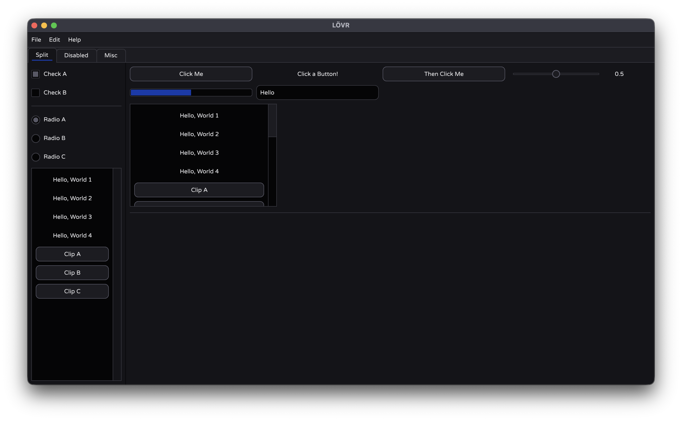
iui.button
A widget that performs an action when pushed.
wasPressed = iui.button(name)
Arguments
| Name | Type | Description |
|---|---|---|
name | string | The ID. Displayed as the button’s text. |
Returns
| Name | Type | Description |
|---|---|---|
wasPressed | boolean | Whether the button was pushed this frame. |
Overview
Buttons take their label as an argument, and return true when they’re pressed. You should invoke the button’s action whenever it returns true. The typical code pattern for a button is to wrap it in an if statement.
if iui.button("Say Hello") then
	print("Hello, World!")
end
iui.checkbox
A widget that toggles boolean values.
newValue = iui.checkbox(name, currentValue)
Arguments
| Name | Type | Description |
|---|---|---|
name | string | The ID. Displayed as the checkbox’s text. |
currentValue | boolean | The existing value for the checkbox. |
Returns
| Name | Type | Description |
|---|---|---|
newValue | boolean | The new value for the checkbox. |
Overview
If the user presses a checkbox, newValue will be the inverse of currentValue, otherwise it’ll be the same. Typically, you’ll have one boolean variable that you both pass to the method and assign its return value to.
local value = true

local function updateUI()
	value = iui.checkbox("Some Checkbox", value)
end